Graffiau
Rydyn ni wedi datblygu'r adnodd hwn i helpu dysgwyr i ddeall mwy am ddewis, llunio a darllen gwahanol fathau o graffiau.
Mae graffiau'n cael eu defnyddio i arddangos gwybodaeth at amrywiaeth o wahanol ddibenion - boed yn arolygon, polau, arbrofion gwyddonol neu werthiant (i enwi dim ond rhai) - ac mae'n bwysig ein bod ni'n gallu eu deall.
Cliciwch ar y botwm 'Nesaf' isod i ddechrau deall sut i ddewis y graff cywir ar gyfer y data.
Rhai diffiniadau
Cyn i ni ddechrau, dyma ambell i derm allweddol y mae angen i chi eu gwybod i helpu gyda'r broses.
- Newidyn Annibynnol: Y peth a newidiwyd (arbrawf) neu'r opsiynau sydd ar gael (arolwg).
- Newidyn Dibynnol: Y peth a fesurwyd (arbrawf) neu'r canlyniadau (arolwg).
- Data Di-dor: Gwerthoedd mesuradwy gyda degolion posib.
- Data Arwahanol: Rhifau cyfan rhifadwy
- Data Categorïaidd: Gwerthoedd sy'n trefnu'n grwpiau, labeli neu eiriau.
Enghreifftiau:
Yn aml, nid yw darllen diffiniadau yn ddigon i'n helpu i'w deall. Rydyn ni felly wedi paratoi rhai enghreifftiau ar eich cyfer chi.
Set ddata 1
Gofynnwyd i 10 disgybl enwi eu hoff ffrwythau, a chofnodwyd y data mewn tabl:
| Ffrwyth | Cyfanswm |
|---|---|
| Afal | 4 |
| Oren | 1 |
| Banana | 3 |
| Grawnwin | 2 |
1. Pa golofn o'r tabl sy'n dangos y newidyn annibynnol a pha un yw'r newidyn dibynnol?
2. Ai data di-dor, arwahanol neu gategorïaidd yw'r ffrwythau?
3. Ai data di-dor, arwahanol neu gategorïaidd yw'r cyfanswm ar gyfer pob ffrwyth?
1. Y rhestr o ffrwythau sydd ar gael i'w dewis yw'r newidyn annibynnol, a'r cyfanswm ar gyfer pob un yw'r newidyn dibynnol.
2. Mae enwau'r ffrwythau yn eiriau yn hytrach na rhifau, felly data categorïaidd yw hwn.
3. Mae'r cyfansymiau i gyd yn rhifau cyfan, felly data arwahanol yw hwn.
Set ddata 2
Mae athro yn penderfynu mesur tymheredd ei baneidiau o goffi dros amser.
1. Beth yw'r newidynnau annibynnol a dibynnol ar gyfer hyn?
2. Pa fath o ddata yw mesuriadau tymheredd?
3. Pa fath o ddata yw amser?
1. Mae'r athro yn mesur y tymheredd, sy'n golygu mai dyna yw'r newidyn dibynnol. Amser fyddai'r newidyn annibynnol.
2. Mae tymheredd yn werth rhifiadol mesuredig, sy'n golygu ei fod yn ddata di-dor.
3. Mae amser hefyd yn werth rhifiadol mesuredig, sy'n golygu ei fod yn ddata di-dor.
Set ddata 3
Casglodd ysgol y data canlynol am y grwpiau dosbarth ym Mlwyddyn 8
| Grŵp Dosbarth | Nifer y disgyblion | Cyfartaledd taldra (cm) |
|---|---|---|
| Aderyn 8 | 28 | 152.4 |
| Cwmhir 8 | 30 | 158.1 |
| Tarren 8 | 27 | 149.9 |
| Glyncoed 8 | 29 | 160.2 |
| Eryri 8 | 31 | 155.5 |
1. Pa fath o ddata yw enw'r grŵp dosbarth?
2. Ai data di-dor neu ddata arwahanol yw maint y dosbarth?
3. Pa fath o ddata yw'r mesuriadau taldra?
4. Os ydyn ni'n edrych ar ba ddosbarth sydd â'r cyfartaledd taldra uchaf, pa ddata yw'r newidyn annibynnol?
5. Beth fyddai'r newidyn annibynnol pe baech chi'n edrych ar effaith maint dosbarth ar gyfartaledd taldra?
6. I gloi, os yw'r cwestiwn dan sylw yn ystyried a yw taldra yn dylanwadu ar y dosbarth y rhoddwyd disgybl ynddo, pa newidyn yw'r un dibynnol?
1. Enwau yw'r rhain, sy'n golygu mai data categorïaidd yw hwn.
2. Nifer yw maint dosbarth, sy'n golygu ei fod yn ddata arwahanol.
3. Mae'r cyfartaledd taldra yn werth rhifiadol mesuredig, sy'n golygu ei fod yn ddata di-dor.
4. Y grŵp dosbarth yw'r newidyn annibynnol.
5. Maint y dosbarth yw'r newidyn annibynnol.
6. Yn yr achos hwn, y grŵp dosbarth yw'r newidyn dibynnol.
Mae'r enghraifft hon yn dangos sut mae'r cwestiwn sy'n cael ei ofyn yn penderfynu pa newidyn yw'r un annibynnol a pha un yw'r newidyn dibynnol.
Dewis eich math o graff
Mae deall dewis graff yn eich helpu i gyfleu canlyniadau'n glir ac i osgoi delweddau camarweiniol.
Mae llawer o wahanol fathau o siartiau a graffiau ar gael i'w defnyddio. Bydd y cwestiynau isod yn eich tywys drwy'r broses o ddewis y math gorau ar gyfer eich data.
Bydd angen i chi fod wedi nodi newidynnau annibynnol a dibynnol eich graff, yn ogystal â'r math o ddata (arwahanol, di-dor neu gategorïaidd), er mwyn bwrw ymlaen.
Bydd y botwm 'Ailosod' yn mynd â chi'n ôl i gwestiwn 1:
Fel dewis arall, rydyn ni wedi cynllunio siart llif i fapio'r holl opsiynau ar eich cyfer - cliciwch yma i weld/argraffu'r siart llif.
Cwestiwn 1
Ai data di-dor yw data'r newidyn annibynnol?
Mae enghreifftiau o ddata di-dor yn cynnwys tymheredd, amser, màs, hyd, uchder, cyfaint neu bellter. Mae'r rhain i gyd yn fesuradwy ar raddfa ac mae'n bosib pennu unrhyw werth iddyn nhw o fewn ystod benodol.
Cwestiwn 2
Ai data di-dor yw data'r newidyn dibynnol?
Mae enghreifftiau o ddata di-dor yn cynnwys tymheredd, amser, màs, hyd, uchder, cyfaint neu bellter. Mae'r rhain i gyd yn fesuradwy ar raddfa ac mae'n bosib pennu unrhyw werth iddyn nhw o fewn ystod benodol.
Cwestiwn 2
Ai data arwahanol yw data'r newidyn annibynnol?
Mae mathau o ddata arwahanol yn tueddu i fod yn nifer o rywbeth. Er enghraifft, nifer y myfyrwyr mewn dosbarth, neu nifer y darnau siocled mewn cwci.
Cwestiwn 3
Ydych chi'n edrych ar ddosbarthiad y canlyniadau?
Mae'r cwestiwn hwn yn gofyn a ydych chi'n bwriadu creu rhywbeth sy'n edrych ar batrwm y set ddata gyfan yn hytrach na gwerthoedd unigol.
Cwestiwn 3
Ai data arwahanol yw'r data dibynnol?
Mae mathau o ddata arwahanol yn tueddu i fod yn nifer o rywbeth. Er enghraifft, nifer y myfyrwyr mewn dosbarth, neu nifer y darnau siocled mewn cwci.
Cwestiwn 3
Ai data di-dor yw data'r newidyn dibynnol?
Mae enghreifftiau o ddata di-dor yn cynnwys tymheredd, amser, màs, hyd, uchder, cyfaint neu bellter. Mae'r rhain i gyd yn fesuradwy ar raddfa ac mae'n bosib pennu unrhyw werth iddyn nhw o fewn ystod benodol.
Cwestiwn 3
A yw'r data dibynnol ar ffurf naill ai canran neu niferoedd?
Cwestiwn 4
Ai amser yw'r newidyn annibynnol?
Cam prosesu
Bydd angen i chi drosi'r newidyn dibynnol yn ganrannau
Cwestiwn 4
Ai amser yw'r newidyn annibynnol?
Graff Gorau:
O ran y data rydych chi wedi'i gasglu, y graff gorau i'w ddefnyddio yw siart bar.
I gael rhagor o wybodaeth am y math hwn o graff, cliciwch ar y botwm 'Nesaf' isod a dewiswch y math o graff cyfatebol o'r ddewislen sydd yno.
Graff Gorau:
O ran y data rydych chi wedi'i gasglu, y graff gorau i'w ddefnyddio yw histogram.
I gael rhagor o wybodaeth am y math hwn o graff, cliciwch ar y botwm 'Nesaf' isod a dewiswch y math o graff cyfatebol o'r ddewislen sydd yno.
Graff Gorau:
O ran y data rydych chi wedi'i gasglu, y graff gorau i'w ddefnyddio yw graff llinell.
I gael rhagor o wybodaeth am y math hwn o graff, cliciwch ar y botwm 'Nesaf' isod a dewiswch y math o graff cyfatebol o'r ddewislen sydd yno.
Graff Gorau:
O ran y data rydych chi wedi'i gasglu, y graff gorau i'w ddefnyddio yw siart cylch neu siart bar.
I gael rhagor o wybodaeth am y math hwn o graff, cliciwch ar y botwm 'Nesaf' isod a dewiswch y math o graff cyfatebol o'r ddewislen sydd yno.
Graff Gorau:
O ran y data rydych chi wedi'i gasglu, y graff gorau i'w ddefnyddio yw graff gwasgariad.
I gael rhagor o wybodaeth am y math hwn o graff, cliciwch ar y botwm 'Nesaf' isod a dewiswch y math o graff cyfatebol o'r ddewislen sydd yno.
Mathau o Graffiau
Nod unrhyw graff/siart yw arddangos canlyniadau mewn 'delwedd' unigol sy'n caniatáu i ddefnyddwyr ddeall y canlyniad ar unwaith heb orfod cyfeirio at y tabl canlyniadau. Dyma pam mae teitlau a labeli yn hanfodol i lwyddiant eich graff.
I gael rhagor o wybodaeth ac arweiniad ar wahanol fathau o graffiau, cliciwch ar y math perthnasol isod.
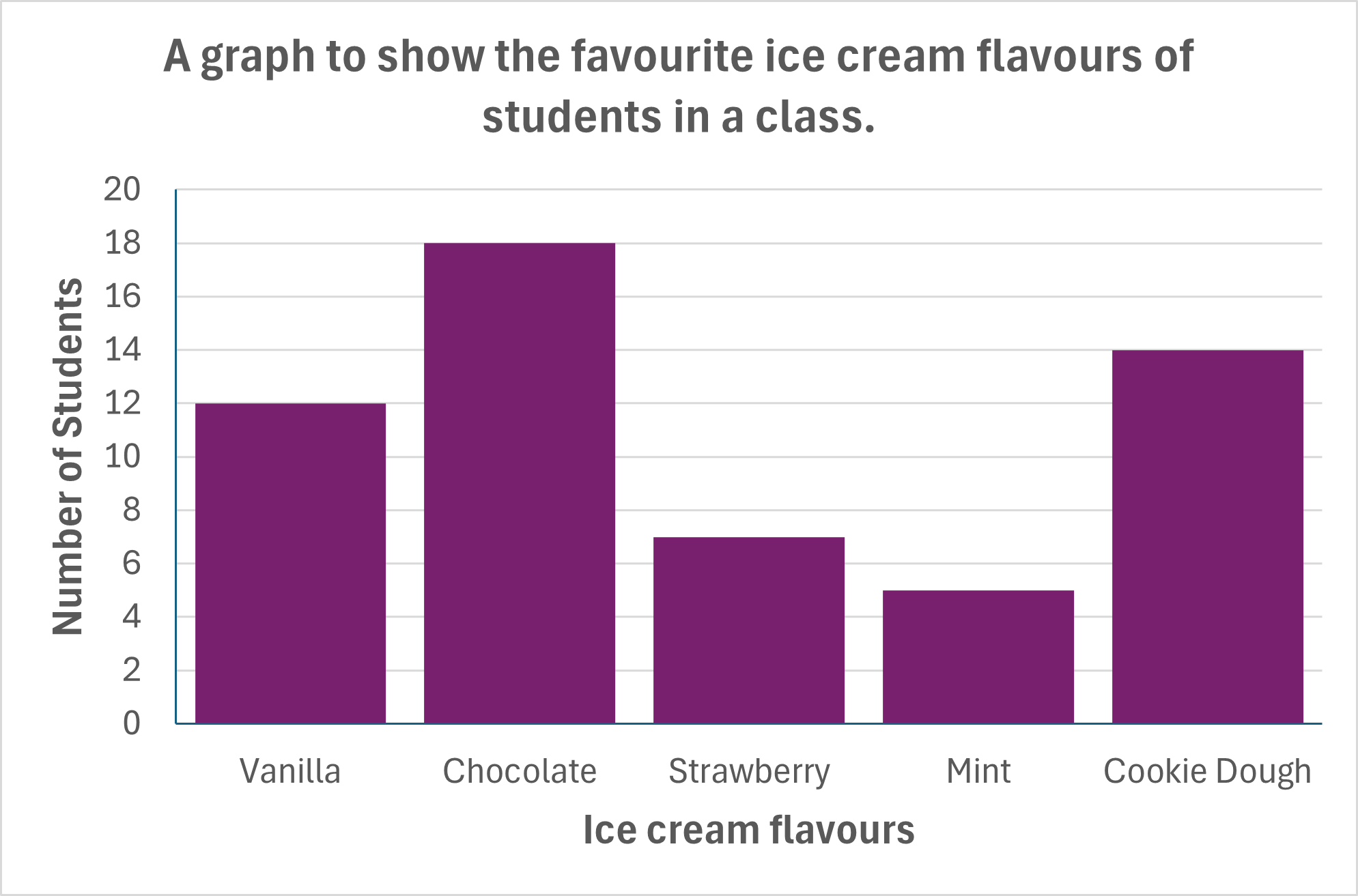
Siartiau Bar

Mae'r rhain yn defnyddio colofnau (neu fariau) i ddangos data mewn siart. Gan amlaf, maen nhw'n cynrychioli niferoedd neu ganran o niferoedd mewn ystod o gategorïau. Mae brig y bar yn cyfateb i raddfa'r echelin y i roi syniad o'r cyfanswm ar gyfer y categori hwnnw i'r defnyddiwr. Po uchaf yw'r bar, yr uchaf yw'r nifer.
Rheolau safonol siartiau bar:
- Mae'r newidyn annibynnol bob amser yn mynd ar hyd yr echelin x (ar draws y gwaelod).
- Mae angen labelu graddfeydd yn glir ac yn gywir.
- Mae angen teitl a labeli echelinau er mwyn i'r defnyddiwr ddeall beth mae'n ei weld.
- Dylid gadael bwlch (o'r un maint) rhwng pob bar.
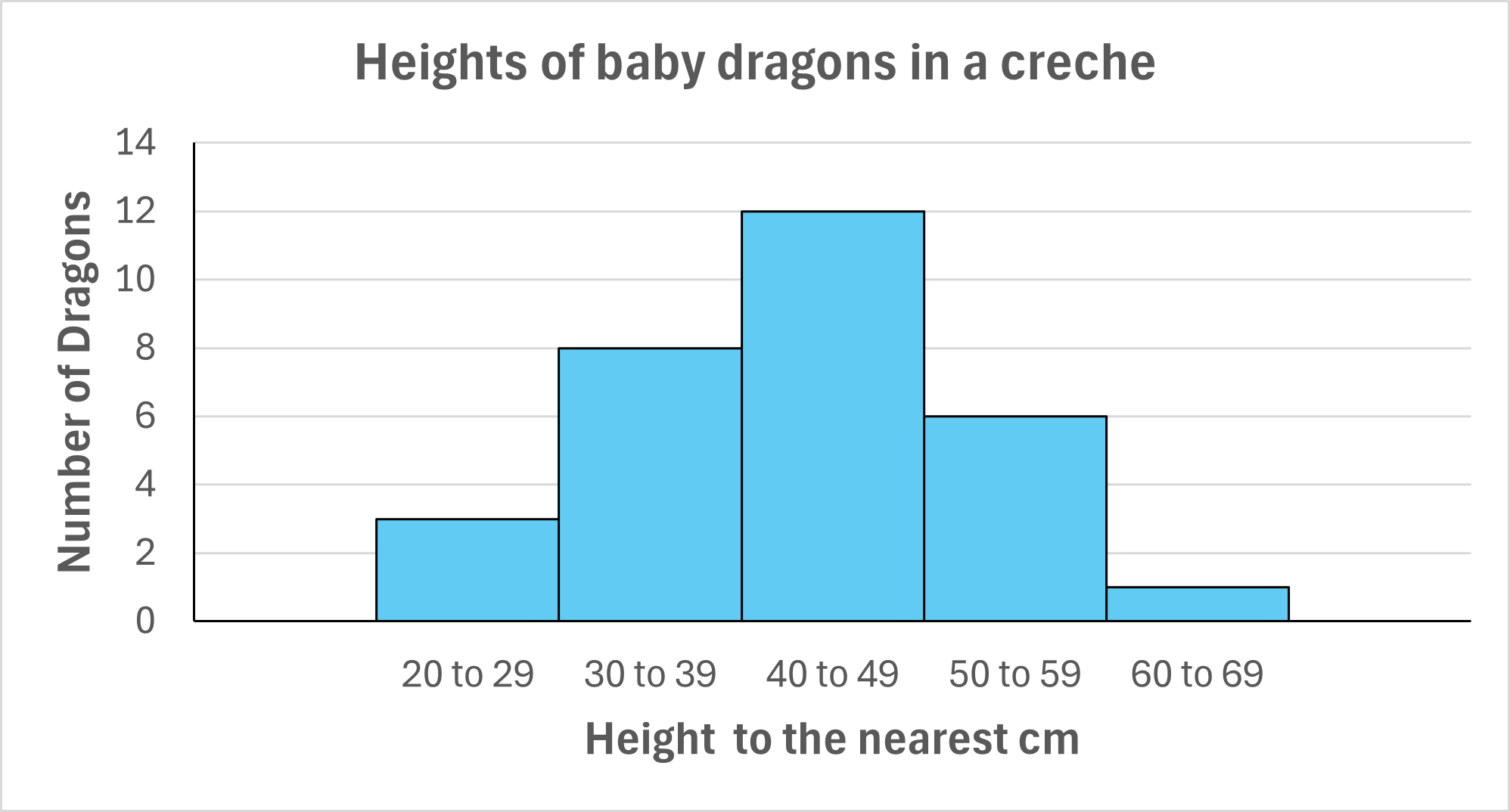
Histogramau
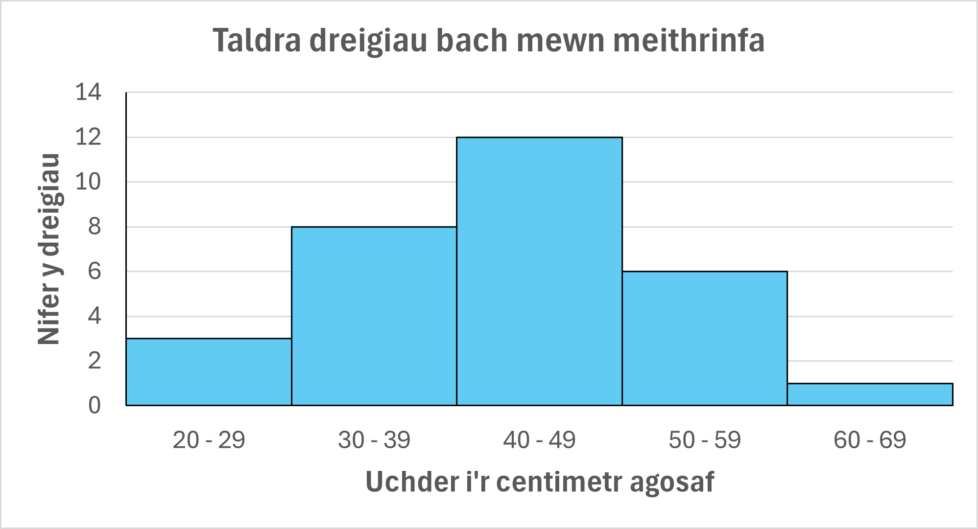
Amrywiad ar siart bar yw hwn, a'r prif wahaniaeth yw'r angen i roi data di-dor mewn categorïau heb fylchau neu orgyffwrdd.
Mae'r rhain yn cael eu defnyddio ar gyfer newidynnau annibynnol fel taldra, pwysau ac oedran.
Rheolau safonol histogramau:
- Mae'r newidyn annibynnol bob amser yn mynd ar hyd yr echelin x (ar draws y gwaelod).
- Mae angen labelu graddfeydd yn glir ac yn gywir.
- Mae angen teitl a labeli echelinau er mwyn i'r defnyddiwr ddeall beth mae'n ei weld.
- Ni ddylai fod bylchau na gorgyffwrdd rhwng bariau.
Oherwydd natur y math hwn o siart, mae hefyd yn bosib cynnwys cromlin ddosraniad ar gyfer y bariau yn ôl yr angen.
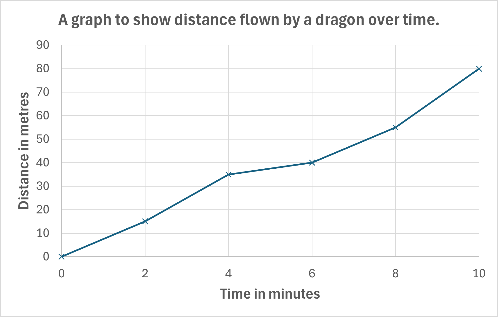
Graffiau Llinell
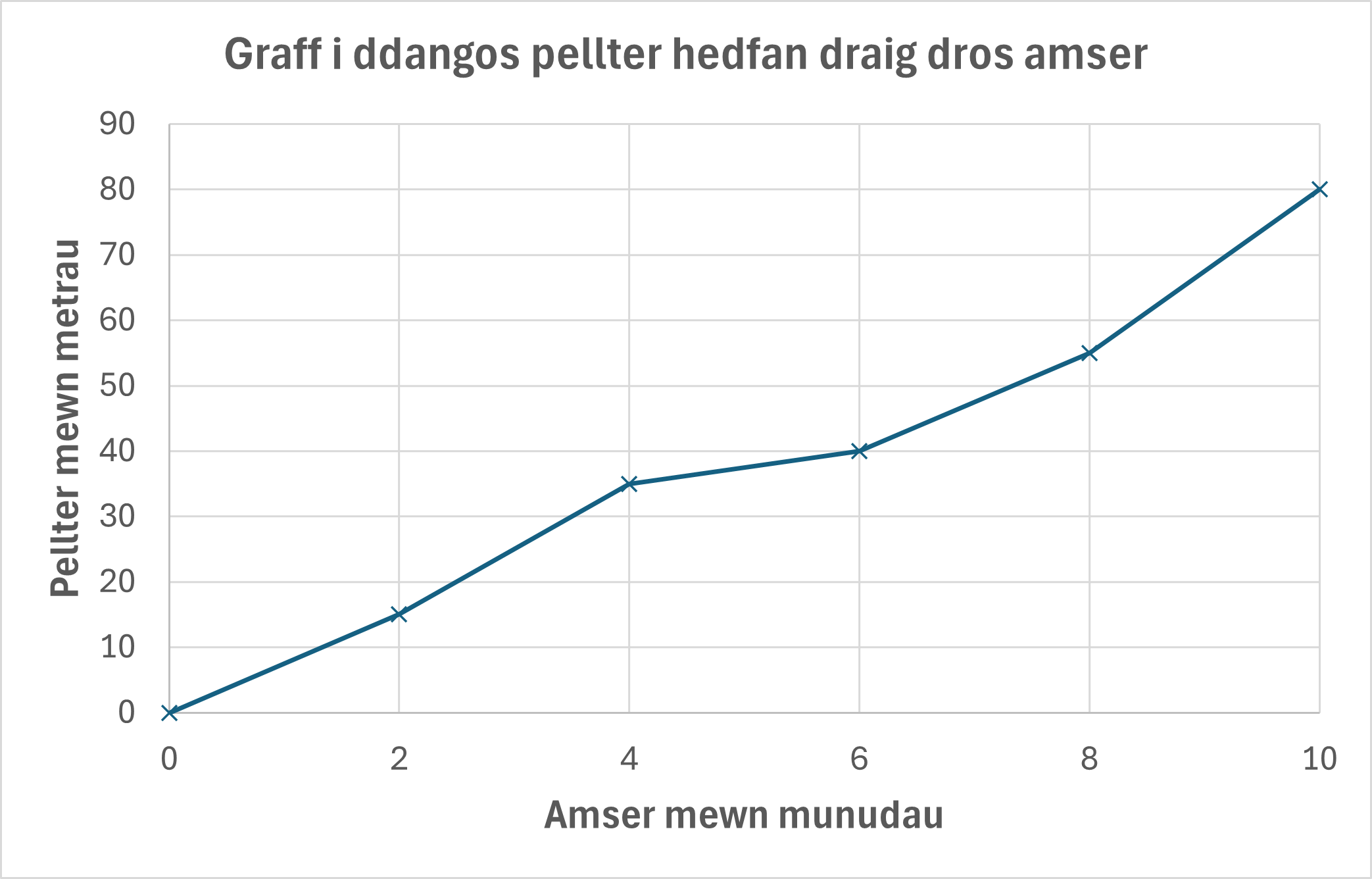
Mae graff llinell yn cysylltu pob pwynt a nodwyd â'r nesaf yn y gyfres ar yr echelin x.
Prif ddefnydd graffiau llinell yw ar gyfer cofnodi canlyniadau dros amser. Er, mae newidynnau annibynnol cynyddol (trefn ystyrlon) eraill yn bosib, megis tymheredd, lefel sain a chrynodiadau cemegol.
Yn y rhan fwyaf o achosion, byddwch yn defnyddio graff gwasgariad gyda llinell ffit orau yn hytrach na graff llinell.
Rheolau safonol graffiau llinell:
- Mae'r newidyn annibynnol bob amser yn mynd ar hyd yr echelin x (ar draws y gwaelod).
- Mae angen labelu graddfeydd yn glir ac yn gywir.
- Mae angen teitl a labeli echelinau er mwyn i'r defnyddiwr ddeall beth mae'n ei weld.
- Bydd y llinell yn cysylltu pob pwynt a nodwyd o'r chwith i'r dde.
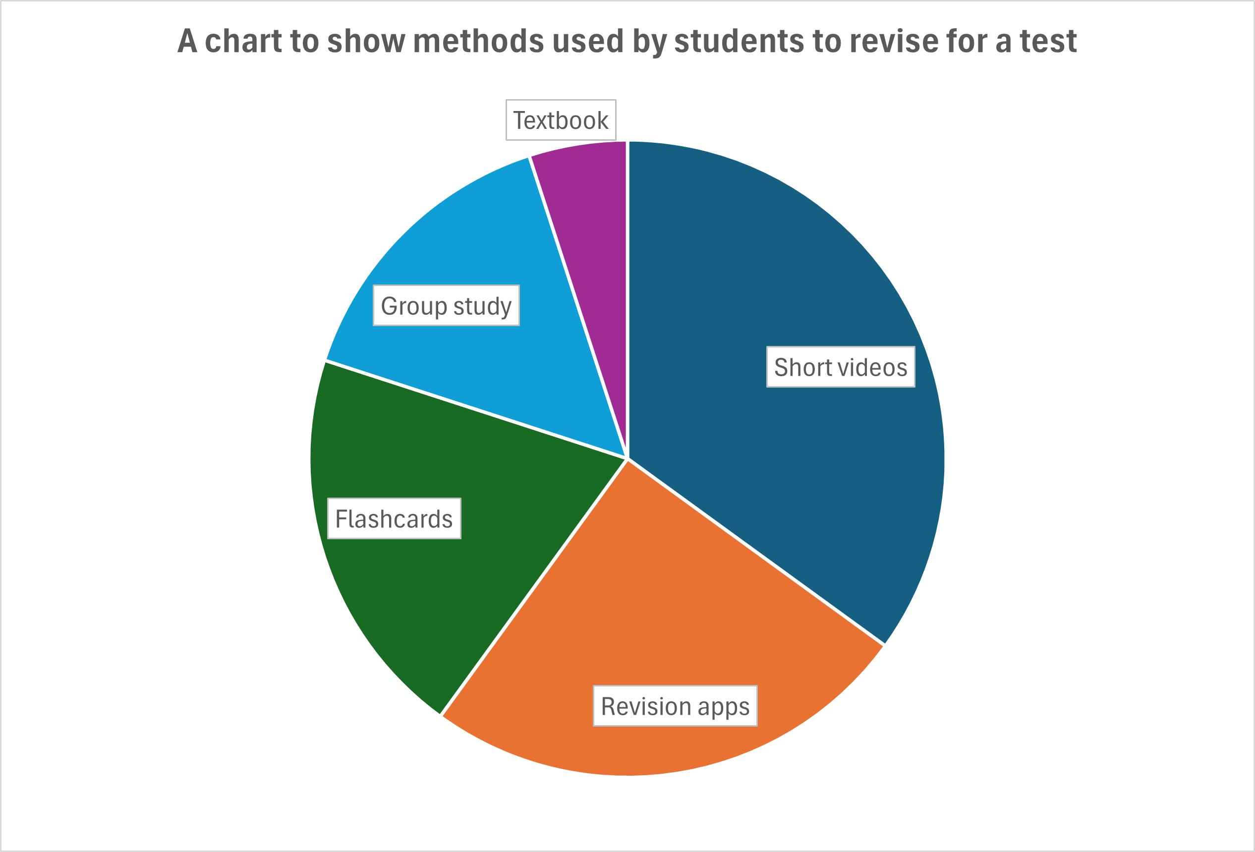
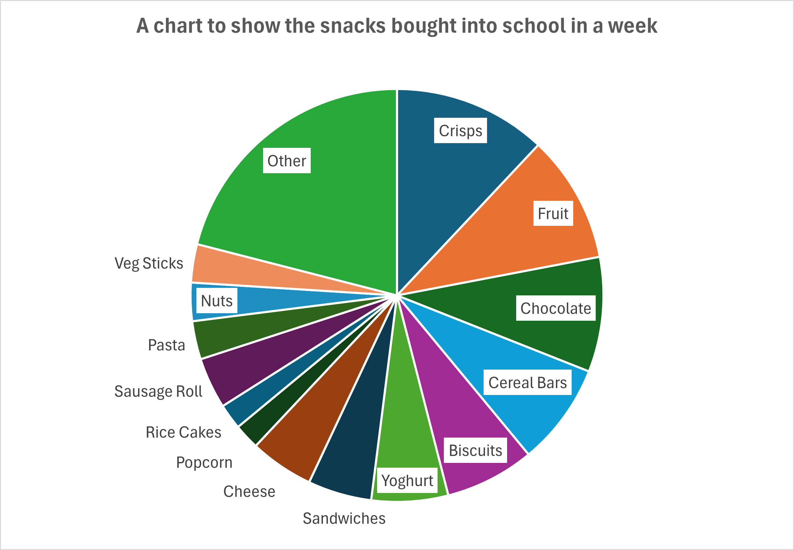
Siartiau Cylch
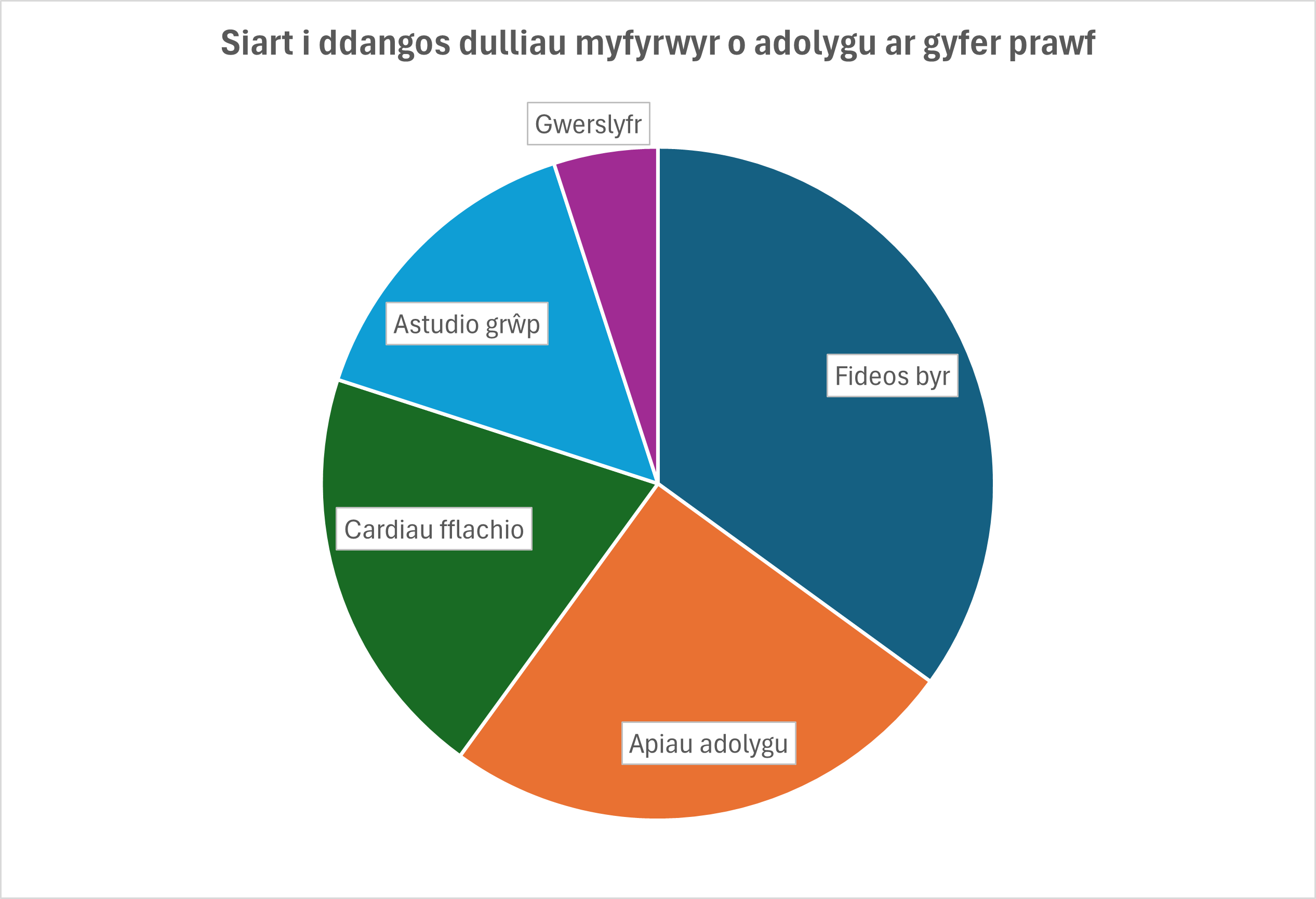
Siartiau crwn yw'r rhain sy'n dangos sut mae canlyniadau'n cael eu rhannu ar draws categorïau. Y drafferth wrth gynhyrchu'r rhain yw bod angen i chi gyfrifo eich graddfa gan ddefnyddio'r 360° sydd ar gael. Felly, os ydych chi'n gweithio gyda chanrannau, mae sector o'r cylch gydag ongl o 3.6° yn gyfystyr ag 1%, tra bod sector gydag ongl o 36° yn hafal i 10%.
Mae'r rhain yn cael eu defnyddio'n bennaf ar gyfer arddangos canlyniadau arolwg, ond mae cyfyngiadau ar eu defnydd. Mae'r cyfyngiadau hynny yn cynnwys y gallu i labelu'r adrannau - mae gormod o ganlyniadau mân eu gwerth yn creu llanast o labeli allanol - ac ni all llygad dynol weld gwahaniaeth rhwng yr onglau pan fydd canlyniadau'n cyfateb yn agos i'w gilydd. Maen nhw hefyd yn cymryd llawer o amser i'w llunio heb gymorth cyfrifiadur.
Rheolau safonol siartiau cylch:
- Dim ond gyda llai na 10 o gategorïau y dylid eu defnyddio yn ddelfrydol; fel arall, defnyddiwch siart bar.
- Mae angen labelu pob sector yn glir; os nad oes lle yn y sector, tynnwch linell daclus i label y tu allan i'r cylch.
- Mae angen teitl ar y siart - yn ddelfrydol, y cwestiwn a ofynnwyd yn yr arolwg.
Dyma enghraifft o sut mae siart cylch yn gallu bod yn rhy anniben ac yn anodd ei ddarllen:
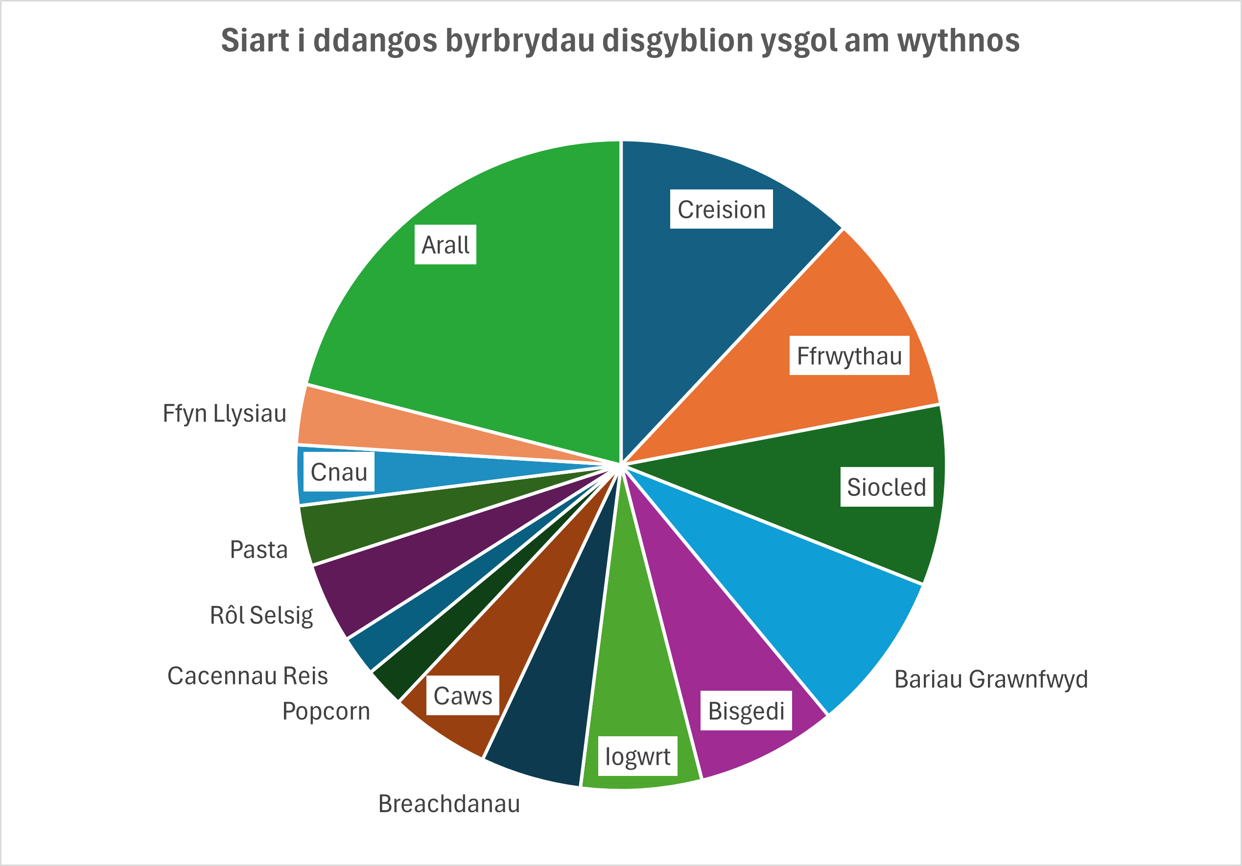
Mae hyn hefyd yn profi sut mae dewis y categorïau anghywir yn gallu arwain at ganlyniadau dryslyd, gan mai 'Arall' yw cyfran fwyaf yr atebion.
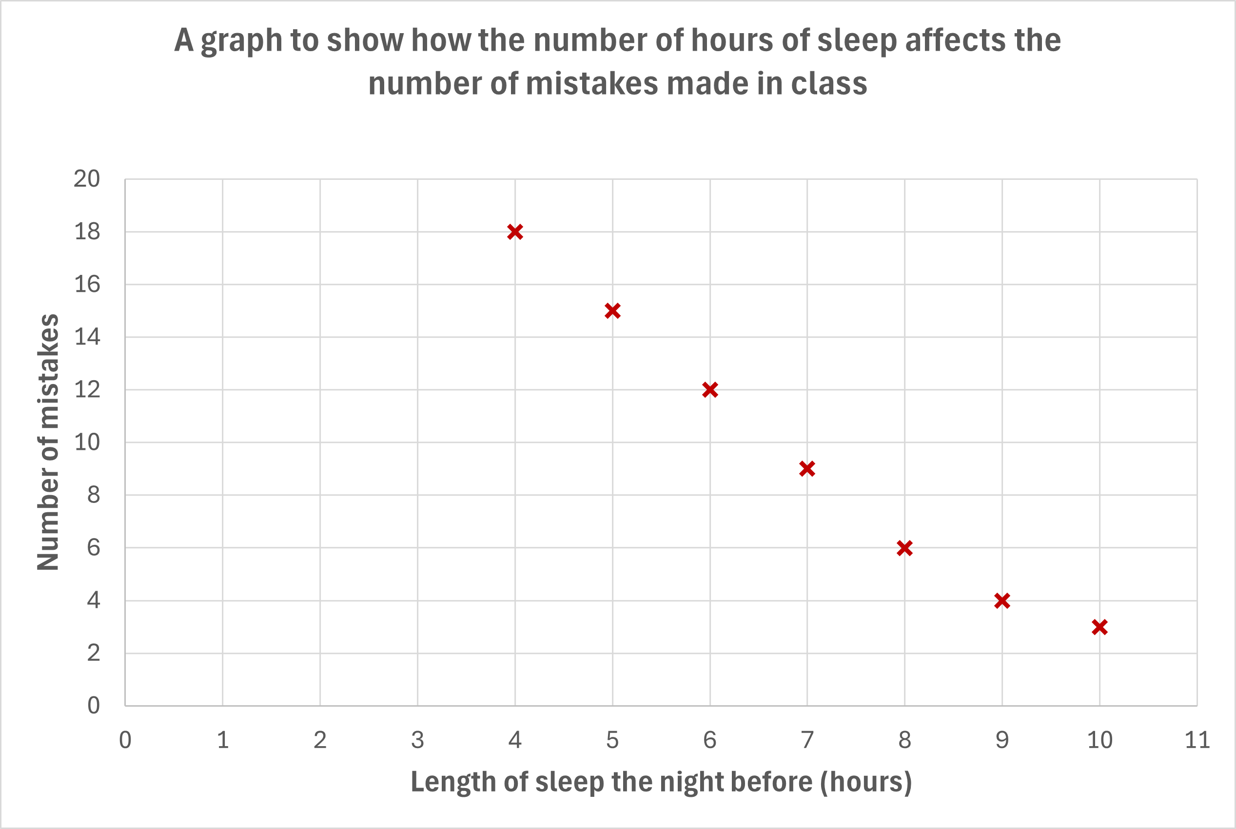
Graffiau Gwasgariad
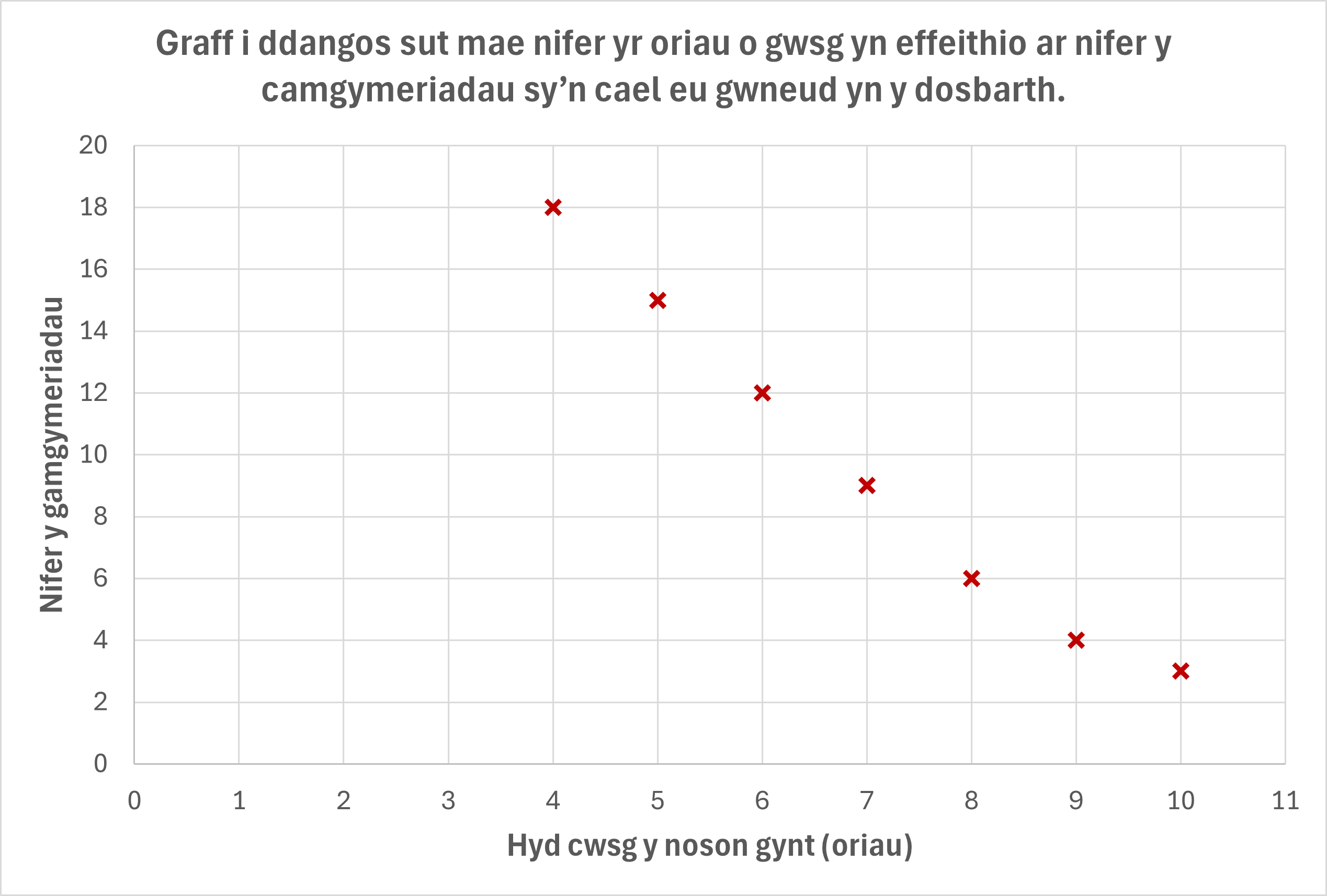
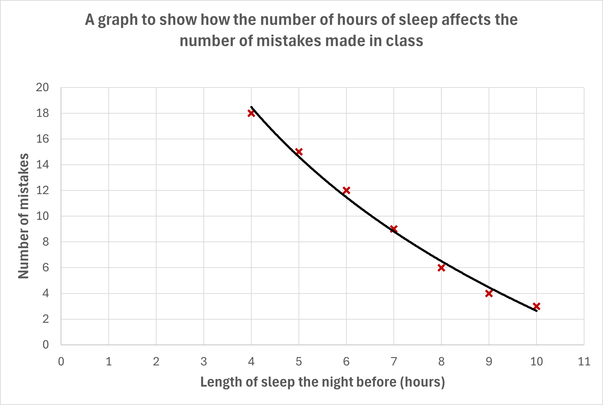
Mae'r graffiau hyn yn defnyddio'r un dyluniad echel a phlotio â graff llinell, ond heb y llinell gyswllt. Dyma'r graff sy'n cael ei ddefnyddio amlaf ar gyfer canlyniadau arbrawf ac mae'n caniatáu i grëwr a/neu ddefnyddiwr y graff greu llinell ffit orau.
Dyma'r un graff eto, ond gyda llinell ffit orau (llinell unigol sy'n cynrychioli patrwm y data) wedi'i hychwanegu.
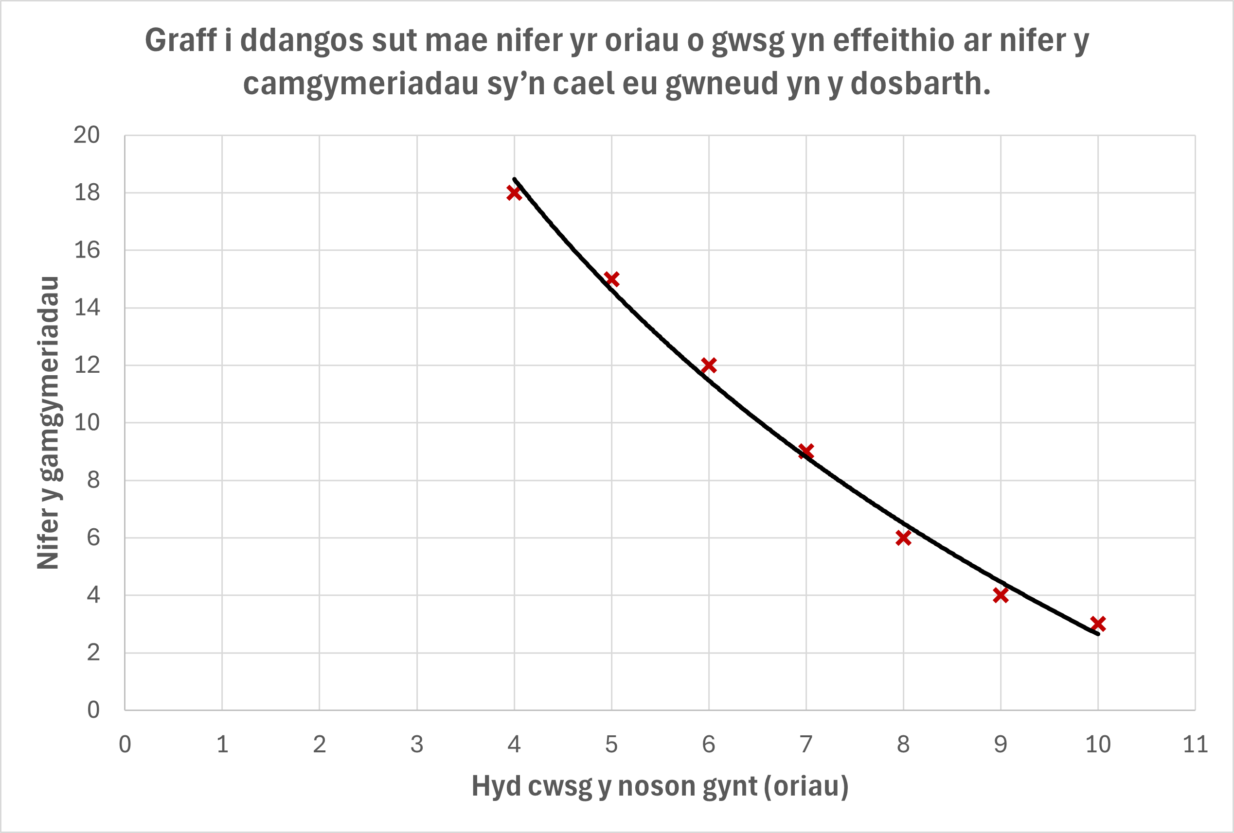
Yn wahanol i graffiau llinell, mae hyn yn caniatáu i ni ddangos data lle mae sawl mesuriad gwahanol yn bosib ar gyfer yr un gwerth newidyn annibynnol.
Rheolau safonol graffiau gwasgariad:
- Mae'r newidyn annibynnol bob amser yn mynd ar hyd yr echelin x (ar draws y gwaelod).
- Mae angen labelu graddfeydd yn glir ac yn gywir.
- Mae angen teitl a labeli echelinau er mwyn i'r defnyddiwr ddeall beth mae'n ei weld.
- Dylai'r pwyntiau a nodwyd fod yn glir; mae tynnu llun croes yn hytrach na dot yn helpu.