Graphs
We have developed this resource to help learners understand more about choosing, drawing, and reading different graph types.
Graphs are used to display information for a variety of different purposes - whether they be surveys, polls, science experiments, or sales (to name just a few uses) - our ability to understand them is important.
Click on the next button below to get started with how to choose the right graph for the data.
Some definitions
Before we get started, here are some key terms you will need to know to help with the process.
- Independent Variable: The thing that was changed (experiment) or the options made available (survey).
- Dependant Variable: The thing that was measured (experiment) or the results (survey)
- Continuous Data: Measurable values with possible decimals
- Discrete Data: Countable whole numbers
- Categorical Data: Values that sort into groups, labels, or words.
Examples:
Just reading definitions is often not enough to help us to understand them. So, we've prepared some examples for you.
Data Set 1
10 pupils were asked about their favourite fruit, the data was recorded in a table:
| Fruit | Total |
|---|---|
| Apple | 4 |
| Orange | 1 |
| Banana | 3 |
| Grape | 2 |
1. Which column of this table shows the independent and which is the dependent variable?
2. Is the fruit continuous, discrete, or categorical data?
3. Is the total for each fruit continuous, discrete, or categorical data?
1. The list of fruit available to choose from is the independent variable with total for each being the dependent.
2. The fruit names are words rather than numbers, so this is categorical data.
3. The totals are whole numbers only, so this is discrete data.
Data Set 2
A teacher decides to measure the temperature of their cup of coffee over time.
1. What are the independent and dependent variables for this?
2. Temperature measurements are what type of data?
3. Time is a type of what data?
1. The teacher is measuring the temperature which makes it the dependent variable. The independent variable would be time.
2. Temperature is a measured numerical value, making it continuous data.
3. Time is also a measured numerical value, making it continuous data.
Data Set 3
A school collected this data about their year 8 form groups
| Form Group | Number of pupils | Average height (cm) |
|---|---|---|
| Aderyn 8 | 28 | 152.4 |
| Cwmhir 8 | 30 | 158.1 |
| Tarren 8 | 27 | 149.9 |
| Glyncoed 8 | 29 | 160.2 |
| Eryri 8 | 31 | 155.5 |
1. What type of data is the form group name?
2. Is the class size continuous or discrete data?
3. The height measurements are what type of data?
4. If we are looking at which form has the highest average height, which data is the independent variable?
5. If you were to instead look at whether class size affects average height, what is the independent variable?
6. Finally, if the question being investigated was whether height influenced which form a student was put in, which variable is the dependent one?
1. These are names which means this is categorical data.
2. Class size is a count, making it discrete data.
3. The average height is a measured numerical value, making it continuous data.
4. The form group is the independent variable.
5. The class size is the independent variable.
6. In this case, the form group is the dependent variable.
This example demonstrates how the question being asked determines which variable is the independent and which is the dependent.
Choosing your graph type
Understanding graph choice helps you communicate results clearly and avoid misleading visuals.
There are many different chart and graph types available to use. The below questions will take you through how to select the best type for your data.
You will need to have identified the independent and dependent variables of your graph, as well as the data type (discrete, continuous, or categorical), to proceed.
This reset button will return you to question 1:
Alternatively, we have designed a flowchart to map out all the options for you - click here to view/print the flowchart.
Question 1
Is the independent variable's data continuous?
Examples of continuous data could include temperature, time, mass, length, height, volume, distance. These are all measurable on a scale and can take any value within a range.
Question 2
Is the dependent variable's data continuous?
Examples of continuous data could include temperature, time, mass, length, height, volume, distance. These are all measurable on a scale and can take any value within a range.
Question 2
Is the independent variable's data discrete?
Discrete data types tend to be the number of something. For example, the number of students in a class, or the number of chocolate chips in a cookie.
Question 3
Are you looking at the distribution of results?
This is asking if you are looking to draw something that looks at the pattern in the whole data set rather than for individual values.
Question 3
Is the dependent data discrete?
Discrete data types tend to be the number of something. For example, the number of students in a class, or the number of chocolate chips in a cookie.
Question 3
Is the dependent data continuous?
Examples of continuous data could include temperature, time, mass, length, height, volume, distance. These are all measurable on a scale and can take any value within a range.
Question 3
Is the dependent data in the form of either percentage or counts?
Question 4
Is the independent variable time?
Processing stage
You will need to convert the dependent variable into percentages
Question 4
Is your independent variable time?
Best Graph:
For the data you've collected, the best graph to use is a bar chart.
For more information on this graph type, click on the next button below and select the matching graph type from the menu provided.
Best Graph:
For the data you've collected, the best graph to use is a histogram.
For more information on this graph type, click on the next button below and select the matching graph type from the menu provided.
Best Graph:
For the data you've collected, the best graph to use is a line graph.
For more information on this graph type, click on the next button below and select the matching graph type from the menu provided.
Best Graph:
For the data you've collected, the best graph to use is either a pie chart or a bar graph.
For more information on this graph type, click on the next button below and select the matching graph type from the menu provided.
Best Graph:
For the data you've collected, the best graph to use is a scatter graph.
For more information on this graph type, click on the next button below and select the matching graph type from the menu provided.
Graph Types
The aim of any graph/chart is to display results in a single 'image' that allows viewers to instantly understand the outcome without needing to refer to the results table. This is why titles and labels are vital to your graph's success.
For more information and guidance on different graph types please click on the relevant type below.
Bar Charts
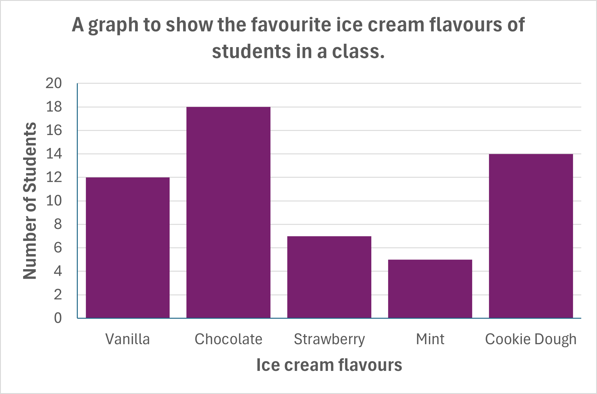
These use columns (or bars) to show data in a chart. Most often the count or a percentage of a count for a range of categories. The top of the bar reads across to the y-axis to give the viewer an idea of the total for that category. The taller the bar, the higher the count.
The standard rules of bar charts:
- The independent variable always goes along the x-axis (across the bottom).
- Scales need to be labelled clearly and correctly.
- A title and axis labels are needed for the viewer to understand what they are looking at.
- There should be gaps (of the same size) between each bar.
Histogram
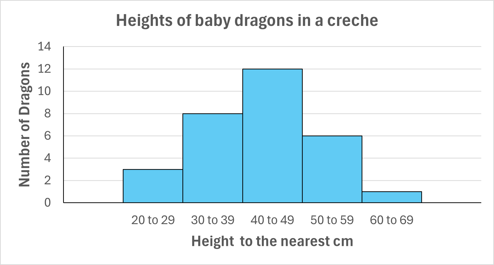
This is a variation of a bar chart, the main difference being the need to put our continuous data into categories with no gaps or overlap.
These are used for independent variables such as height, weight, and age.
The standard rules of histograms:
- The independent variable always goes along the x-axis (across the bottom).
- Scales need to be labelled clearly and correctly.
- A title and axis labels are needed for the viewer to understand what they are looking at.
- There should be no gaps or overlapping between bars.
Due to the nature of this type of chart, we can also include a distribution curve for the bars when needed.
Line Graphs
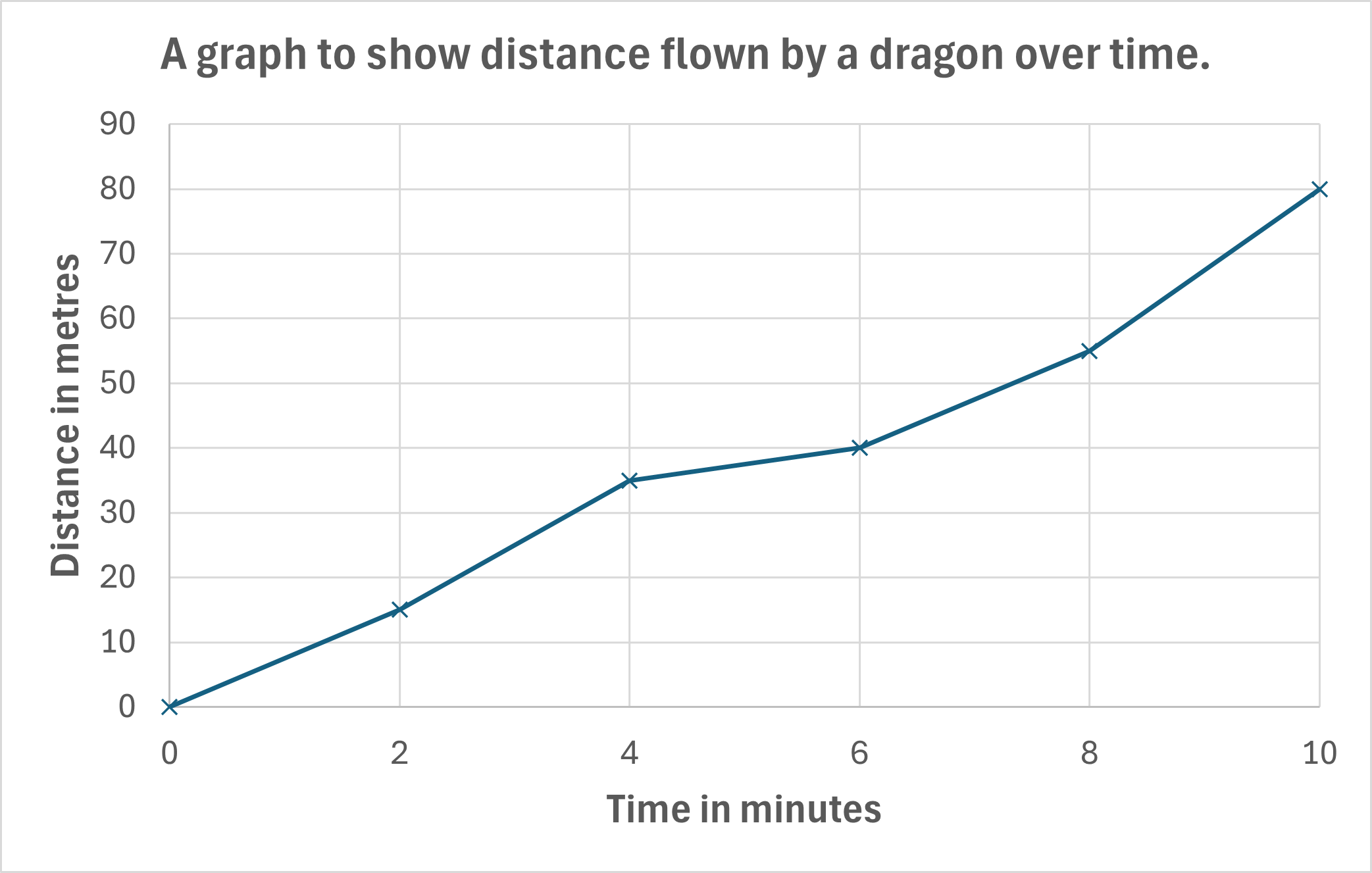
A line graph connects each plotted result to the next in the series on the x-axis.
The main use for line graphs is for recording results over time. Although, other progressive (meaningful order) independent variables are possible, such as temperature, sound level, and chemical concentrations.
In most instances, you will use a scatter graph with a line of best fit rather than a line graph.
The standard rules of line graphs:
- The independent variable always goes along the x-axis (across the bottom).
- Scales need to be labelled clearly and correctly.
- A title and axis labels are needed for the viewer to understand what they are looking at.
- The line will join each plotted result from left to right.
Pie Charts
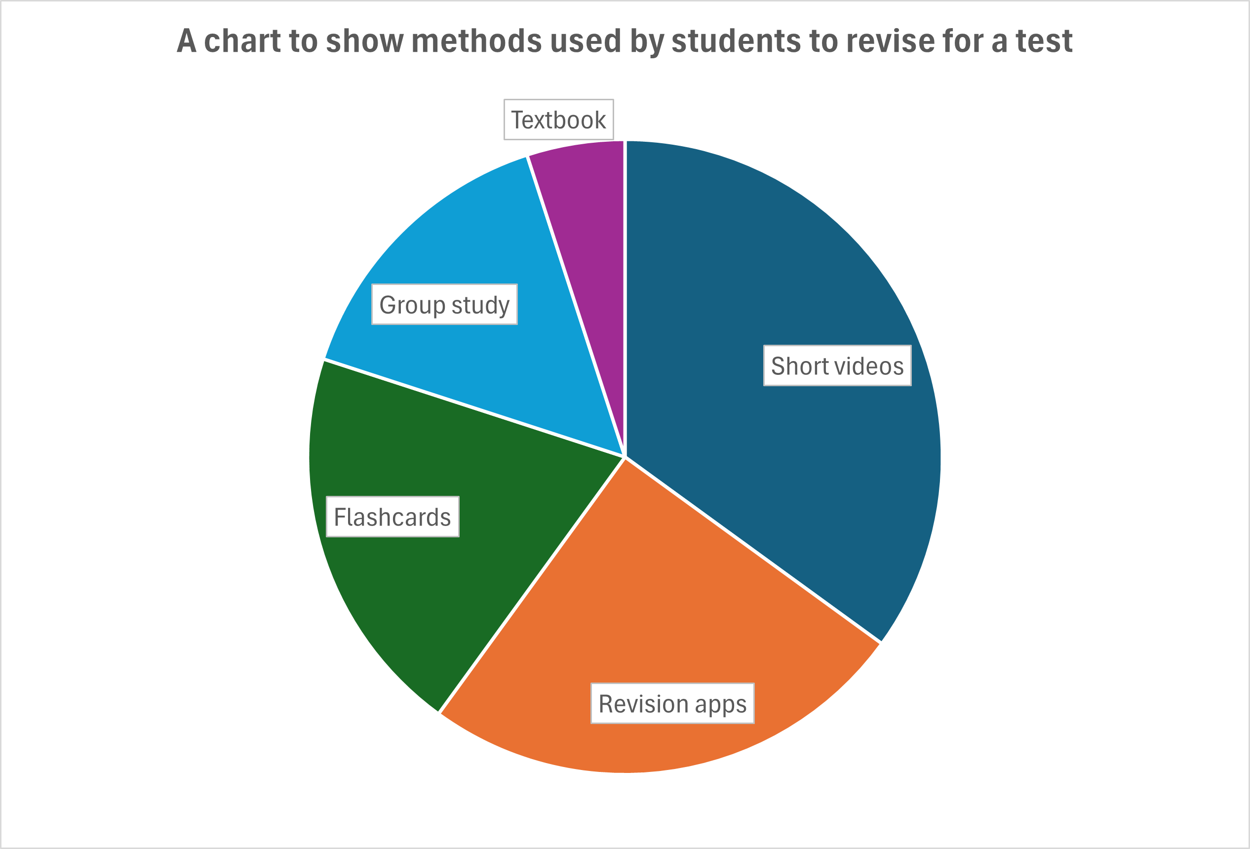
These are circle charts that show how results are split across categories. The difficulty in producing these is that you will need to calculate your scale using the 360° available. So, if you are working in percentages, a section of the 'pie' (circle) with an angle of 3.6° is the same as 1%, whilst a section with an angle of 36° equals 10%.
These are mostly used for displaying survey results but have limitations. These include, being able to label the sections - too many small value results make it a mess of external labels or having results that are too closely matching for the angle's variation to be detectable easily with the human eye. They are also very time-consuming to draw without computer aid.
The standard rules of pie charts:
- Ideally, only use if less than 10 categories, otherwise use a bar chart.
- Label each section clearly, if there's no space in the section, neatly draw a line to a label outside the circle.
- The chart needs a title - preferably the question asked in the survey.
Here is an example of how a pie chart can become overly cluttered and hard to read:
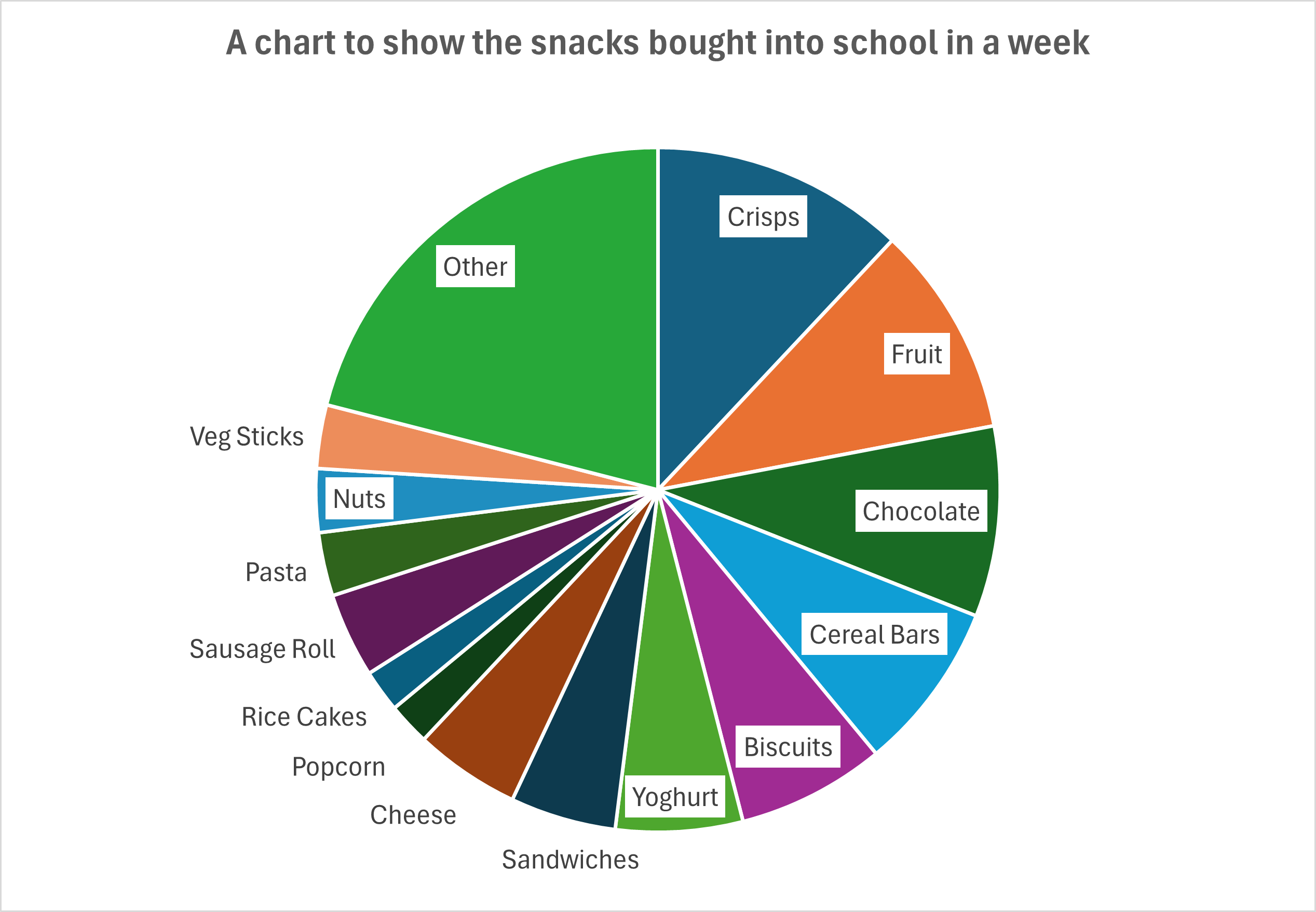
This is also a demonstration of how choosing the wrong categories can lead to confusing results, as the largest proportion of answers were 'Other'.
Scatter Graphs
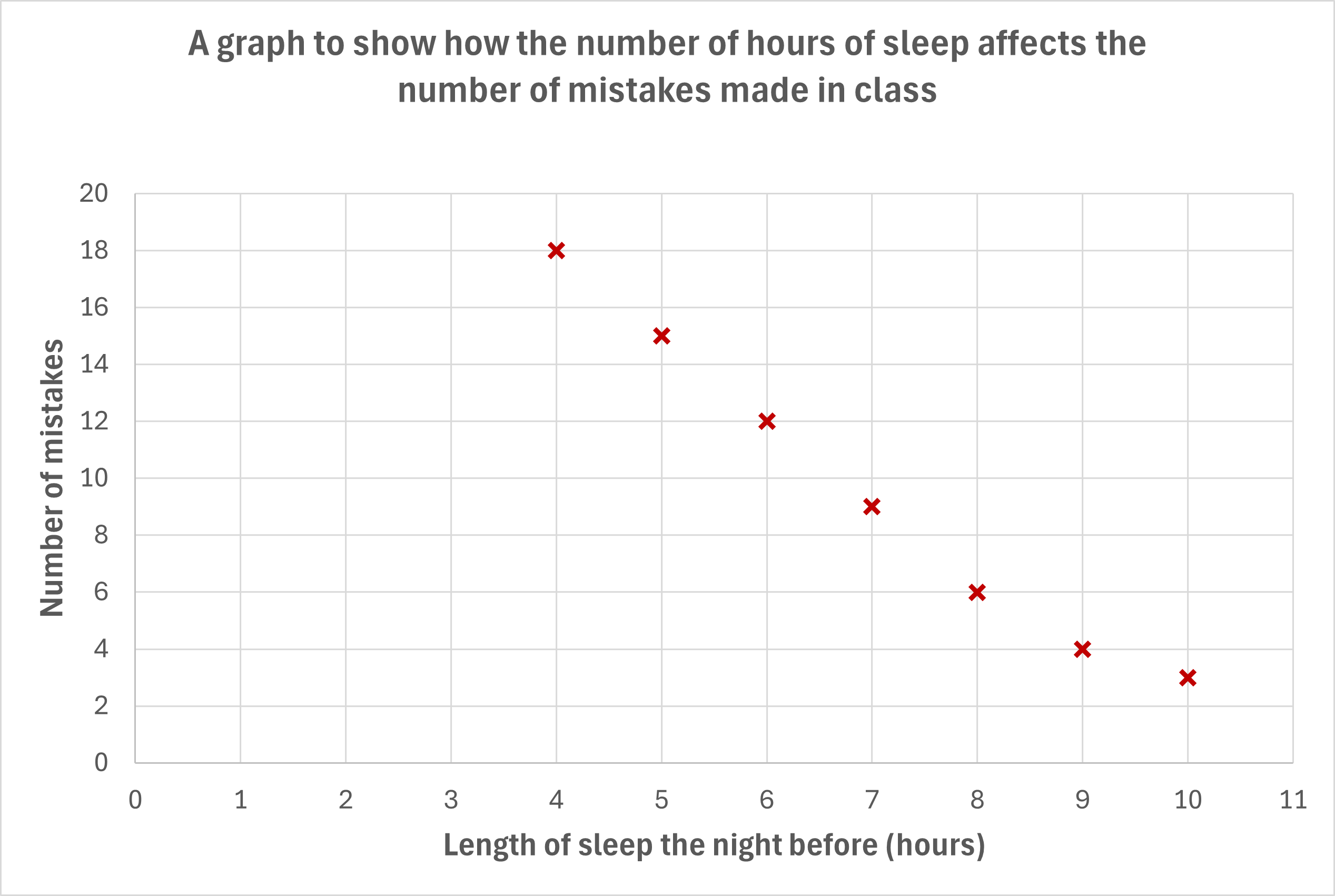
These graphs use the same axis design and plotting as a line graph, just without the connecting line. This is the most common graph used for experiment results and allows the creator and/or user of the graph to apply a line of best fit.
Here is the same graph again but with a line of best fit (a single line that represents the pattern of the data) added.
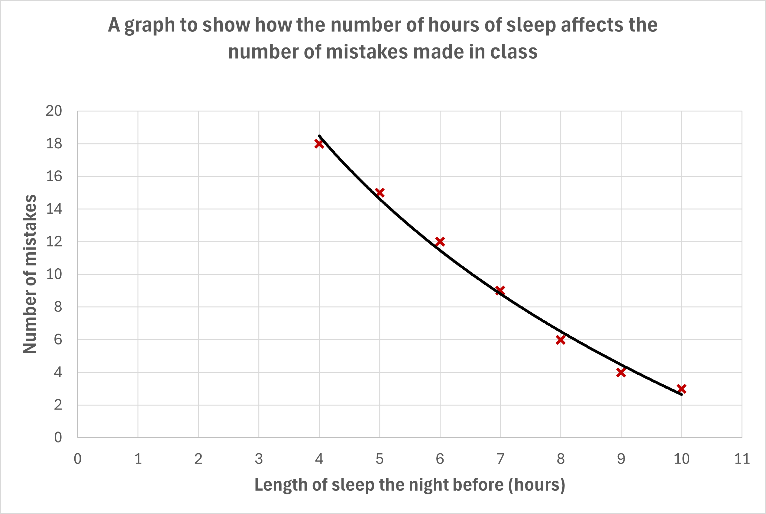
Unlike line graphs, this allows us to show data that may have several differing measurements for the same independent variable value.
The standard rules of scatter graphs:
- The independent variable always goes along the x-axis (across the bottom).
- Scales need to be labelled clearly and correctly.
- A title and axis labels are needed for the viewer to understand what they are looking at.
- The plotted points should be clear, drawing a cross rather than a dot helps.